
Does my cover art matter?
Yes! The way you choose to design a podcast cover will have a massive impact on whether new subscribers choose to download and listen to your podcast episodes or not.
When your visuals aren’t on the same level as your content, people won’t listen. So if you’re pouring your heart into incredible content and hosting interesting interviews with podcast guests but ignoring your covert art… you’re losing out on subscribers who should be loving your show!
Podcast cover art is the single biggest factor in determining if a potential listener will hit play or skip to something else.
Because this visual element of your podcast is so crucial to your success, we’re here to offer some design principles and do’s and don’ts so you can design a podcast cover that converts.
Key takeaways
In this post, you’ll learn why your podcast cover design matters and how to design podcast cover images that convert:
- Podcast cover art plays a critical role in podcast discovery and downloads, influencing whether listeners choose to press play.
- The recommended podcast cover size is 3000×3000 pixels, ensuring high-quality display across mobile apps, desktop players, and featured placements.
- High-resolution images prevent blurriness, pixelation, and text distortion, especially on smaller screens.
- Simple, uncluttered layouts help podcast titles and branding stand out in crowded feeds.
- Strategic color choices and high-contrast color palettes improve readability and visual impact.
- Using a professional, high-quality image (especially a personal photo) builds trust and recognition with potential listeners.
- Podcast cover art should visually communicate the tone, topic, and personality of the show to set accurate expectations for new listeners.



What does a podcast cover image need?
Just like a book, your podcast will be judged by its cover.
Because of how quickly potential listeners are scanning content, you have three seconds to make a positive impression.
A magnetic podcast cover requires a balance of non-negotiable technical rules and unapologetic brand strategy.
This is the key to taking up space and getting the attention you deserve instead of slowly fading into the digital background.
When you design a podcast cover, size matters
Whatever image you create or decide to use, you must get the sizing exactly right.
For a podcast cover, the gold standard is 3000×3000 pixels.
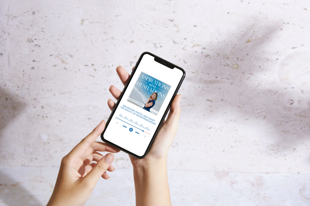
Using a high-resolution image is critical because podcast cover art is viewed on a number of different platforms and in many different sizes.
If someone finds your podcast on a phone (the most likely scenario), you need a high-resolution image to ensure:
- Text stays sharp even when shrunken down to a tiny square
- Design details don’t get blurry or pixelated
- Contrast remains intact so your podcast cover is easy to see and read
Low-resolution images that get compressed for mobile viewing quickly become grainy, blurred, and impossible to read.
A high-res image is also best for use on computers, where podcast cover art is often displayed in larger formats.
Keeping your podcast cover design to a 3000×3000 pixel size will help maintain the design, legibility, and details no matter how your cover is displayed: in app thumbnails, featured carousels, search results, promo emails, smart TVs, or car dashboards.


Design a podcast cover that is easy to read
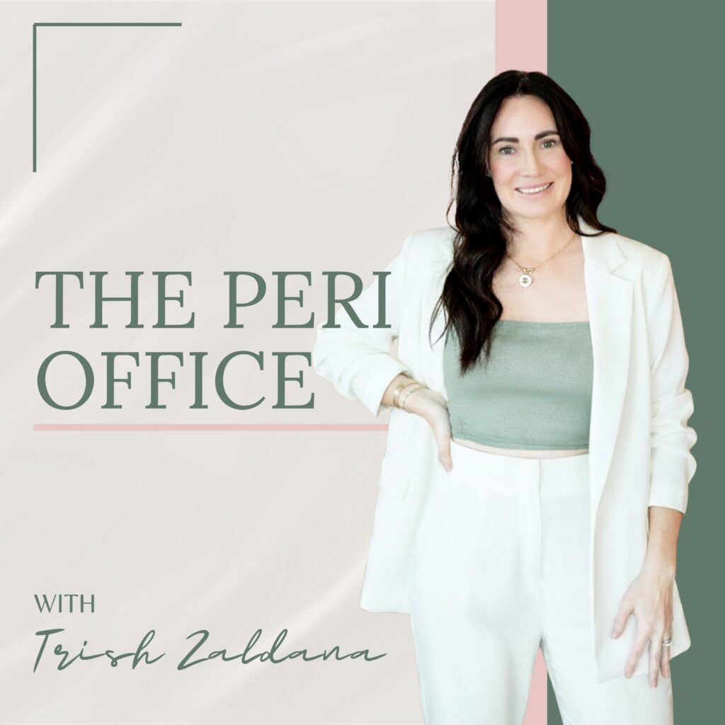
Legibility is your #1 priority when designing the cover art for your podcast.
You want the title of your podcast and any associated branding to be crystal clear, whether the image is viewed on a computer screen or as a tiny thumbnail on a phone.
When it comes to podcast cover design, less is more.
You want to avoid clutter so the key information is front and center and easy to read.
If you’re not getting the podcast download numbers you want, the first step is always to audit your podcast cover.
Is it hard to read when it’s shown in a tiny square?
Is the title lost among other details or information?
Can you quickly read and understand the title with a quick glance at the image?
If the answer to any of those questions is no (or even maybe!), you should consider cleaning up your cover art to make a better first impression!
Do’s and don’ts to follow when you design a podcast cover
Because your podcast cover image is what attracts (or repels) potential listeners, it’s important to get this visual right.
Do:
- Use consistent colors
- Keep your cover art clean and simple
- Align your podcast with your existing personal or business brand
Don’t:
- Use an image smaller than 3000×3000 pixels
- Ignore how easy (or hard) it is to read your title font
- Assume everyone will see your podcast cover art in the same size or format
Let’s look at some more specific professional tips for designing a podcast cover that gets attention and encourages more people to listen to your content!
How do you choose the right colors to design a podcast cover?
A crisp, clear, easy-to-read podcast cover includes the right colors.
Here are some key design principles to follow when choosing colors for your podcast cover:
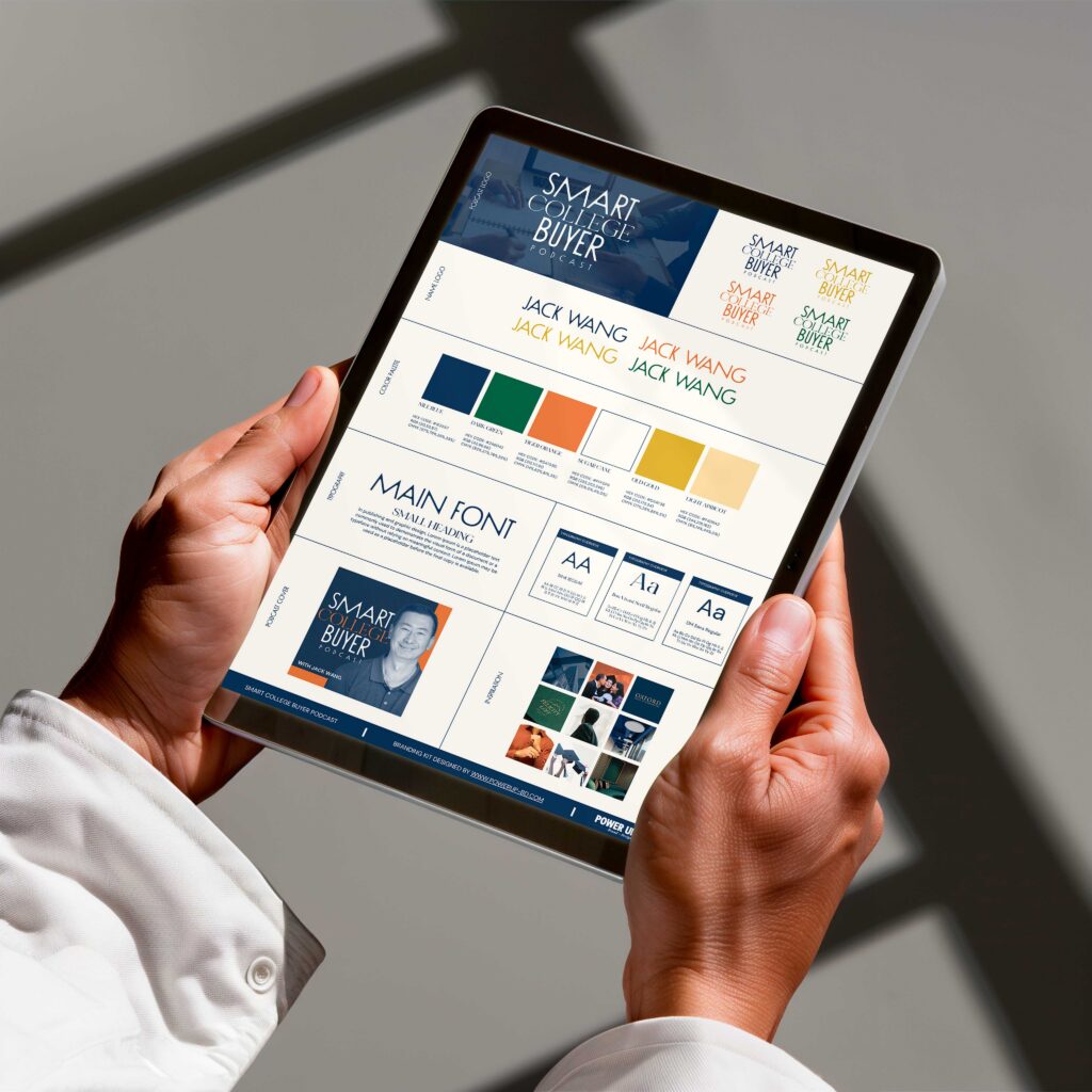
- Use your brand’s colors (if you don’t have an existing brand, choose 2-3 colors that work well together and use them consistently. This is referred to as a “color palette” in design terms.)
- Choose high-contrast colors to make things easier to read (for example: a bright background with dark text)
- Limit the number of colors on your covert image (ideally you will only use two high-contrast colors)
In addition to your color selection, the typography you choose will help guide the potential listener’s eye to the right information. The most important word in the title should be the visual star (aka the bigger text).
The brand or podcast name should always be the largest text in the image.
Should I use a photo for my cover image?
As brand strategists, we highly recommend using an image in your cover art.
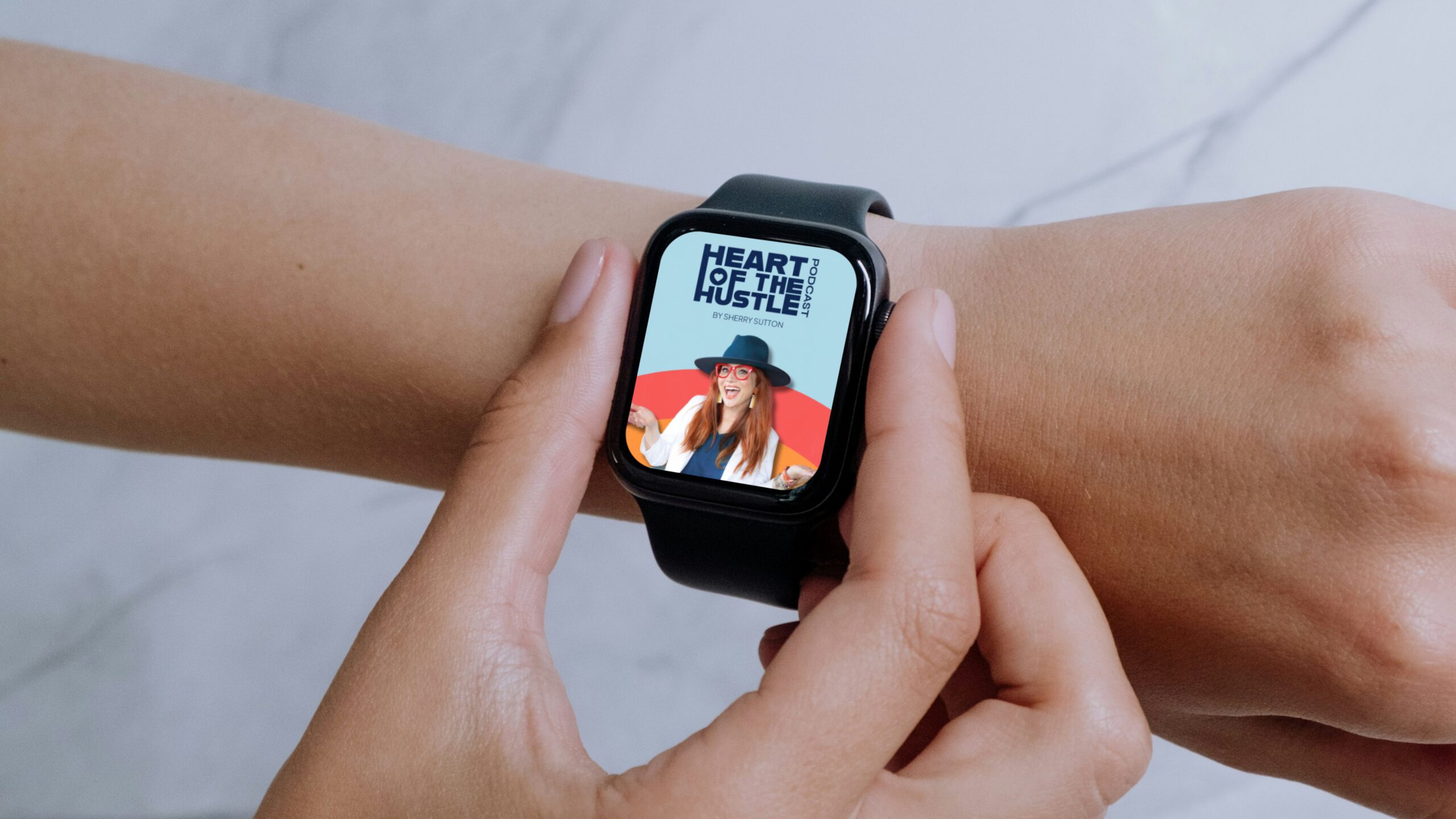
The best image to use is one that shows your face. A high-quality, magnetic image can tell a story and help build immediate trust between you and your listeners.
We don’t recommend using a boring headshot or an image that’s too busy. Choose a photo that communicates your personality and the tone of the podcast.
If you choose not to use a personal image, you can also choose a powerful, abstract, or symbolic image that reflects your culture and purpose.
Any image you choose to use for your podcast cover should reflect the tone of your brand and match the vibe of your content. A funny show should have fun, playful imagery while a serious topic should use a more polished and premium image.
Want to design a podcast cover that converts?
After reading this post, you have all the tools you need to move from “I should really pay attention to my podcast cover art” to a magnetic, high-impact design that attracts more listeners and gets your podcast more downloads.
Focusing on your podcast cover is the first step to levelling up your podcast presence and building more credibility as a podcast host.
Follow these design principles to design a podcast that shines luz.
And if you want to leave the podcast cover art to the professionals, our team at Hola Luz is more than happy to help you with that! Click here to check out our Podcast Design Services and see how we can support your podcast growth.

Hi! I am Natalia, Founder of Hola Luz Creative Studio.
Your brand strategist, creative visionary, entrepreneur at heart, and cheerleader for your brand's success. I'm here to empower you to elevate your business, connect with your target audience, and express your unique story through powerful brand design. Let's collaborate, create, and make an impact together!
BLOG
How to Design a Podcast Cover that Converts
BRAND DESIGN
WEB DESIGN
CLIENT HIGHLIGHTS
FOUNDERS

