
Showit is our favorite platform for designing websites that look stunning and convert.
But highly effective websites don’t just happen by accident – there’s a whole lot of strategy, research, intention, and experience that goes into turning a blank canvas into a stand out, strategic website that works for you 24/7.
Today we’re sharing 5 of the top things your Showit website needs if you want to turn more of your website visitors into happy, paying clients.
How many of these elements do you have in place on your Showit website? Let’s find out!
The best Showit website designs include a CTA
A CTA – or call to action – is where you tell people what to do or where to go next.
A call to action button can be anywhere on your page – from the hero section to the bottom of the page. These buttons should be a bold, contrasting color that stands out from the colors used on the rest of your website to grab attention. We also recommend writing your CTA button text in ALL CAPS or Only capitalizing the first letter of the phrase. Writing Your CTA Button Text in Title Case (as used here) makes it harder for your visitor to read the button and may reduce the number of people who click on it.
In addition to the CTA buttons throughout your website, each page should have a clear Call to Action section, typically at or near the bottom of the page. This is where you tell your visitor where to go next or what action they should take. Your call to action usually consists of a question or statement plus some clarifying information and a button.
Example:

Your CTA should typically direct visitors to either your services page or your contact/booking page or form. This can vary depending on your process and unique customer journey.
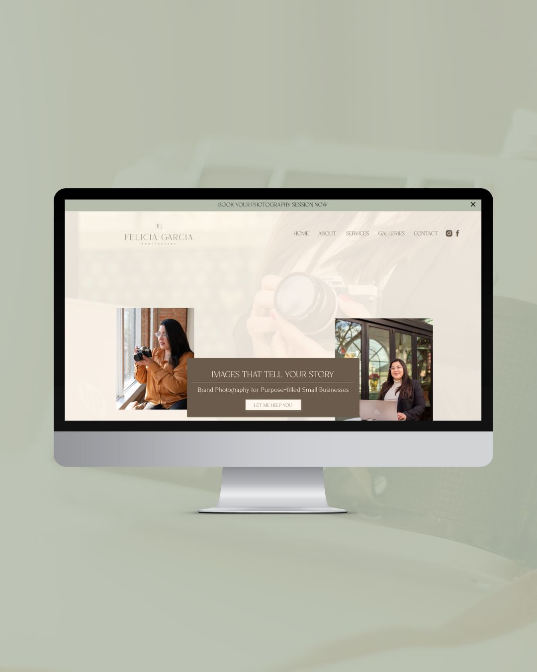
Showit website designs need professional photos
Professional brand photography will really set your website apart from the other DIY and generic websites out there.
At PowerUp, we help you figure out what images you need as well as how you can bring your brand to life with the right brand photos.
Taking time to intentionally plan for your brand photo shoot ensures you get the images you need in the layouts and sizes you need.
Your hero section usually requires a horizontal image with plenty of white space, while an “about me” section photo should be a close-up of you looking at the camera and smiling.
When you work with us, we’ll not only help you get the photos you need, we’ll make sure they are optimized for website speed and SEO. (It’s the little things that really make your website more effective and professional!)

Your website should take your visitor on a journey
Websites that convert do more than just share information or tell your visitor what you can do. Truly effective websites take your customer on a specific journey that ends with them taking the action you want them to take.
Before you can plan your website’s customer journey, make sure you know the end goal.
Do you want a visitor to fill out your contact form? Book a call? Purchase a product? Join your email list?
There are endless options – but you want to be clear on the most important action you want your visitors to take.
This action is essentially the first step in your customer process – so make sure it’s easy, accessible, and clear.
Showit website designs are more effective with consistent branding
If you’ve invested in a professional brand, it’s important that those assets are used consistently throughout your entire website.
Save yourself a lot of time and headache with the global design settings. On your Showit dashboard, click on “Site” and then “Design Settings.” You can set the color palette, fonts, sizes, and global style settings so everything is consistent across your website without you having to manually update each page!
If your brand is bold and courageous, make sure the copy, photos, and layout are also bold and courageous.
If your brand is soft and feminine, those values should be reflected in every detail and word on your site.
Cohesive branding creates a unique, specific experience for your visitor and also communicates your values and priorities. An inconsistently branded website – with different colors, tones, and fonts used on different pages – will confuse your visitor and negatively impact the trust they have in your business.
If you don’t have a professional brand and you’re trying to improve your website, we can help you!

Do you have a contact form?
Even the best Showit website won’t turn visitors into clients without a clear way of moving forward or taking the next step in working with you.
Make it easy for your visitors to get in touch with a clean, simple contact form.
Whether you embed it on every page or have a separate Contact Page on your site, the goal is to give your visitors somewhere to go to take the next step!
Conversions increase the easier it is to contact you.

With these elements in place, your website is set up to convert like a dream!

Hi! I am Natalia, Founder of Hola Luz Creative Studio.
Your brand strategist, creative visionary, entrepreneur at heart, and cheerleader for your brand's success. I'm here to empower you to elevate your business, connect with your target audience, and express your unique story through powerful brand design. Let's collaborate, create, and make an impact together!
BLOG
Showit Website Designs that Convert
BRAND DESIGN
WEB DESIGN
CLIENT HIGHLIGHTS
FOUNDERS

